Think simple
It’s so easy, especially these days with such a wealth of information and creative people online to over think and work our art. Granted the Sistine Chapel wouldn’t have made such an impact with out meticulous planning and 4 years however there is a certain magic and beauty in simplicity.
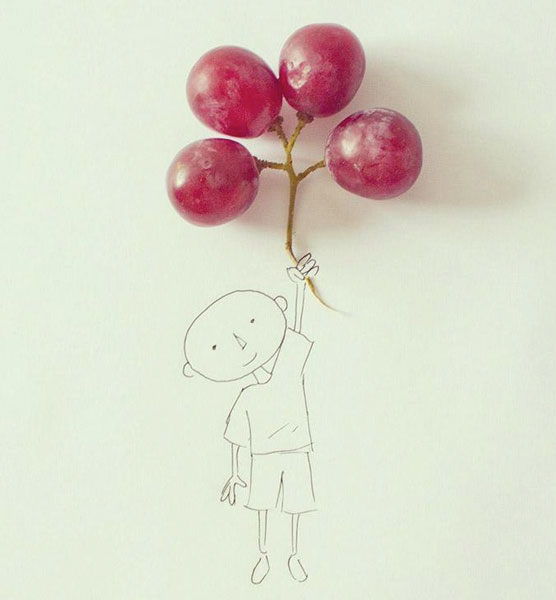
My first example is by Ecuadorian illustrator Javier Perez who combines everyday objects with his simple illustrations to create imaginative and quirky composite drawings. All I know is why this appeals to me, the design accesses a child like imagination that we lose as we get older, a grape is just a grape but to a child it could be anything if put in the right context, here a balloon! BUT the drawing is executed carefully and perfectly by a professional artist, every line is necessary to create the image and every line adds to the character.
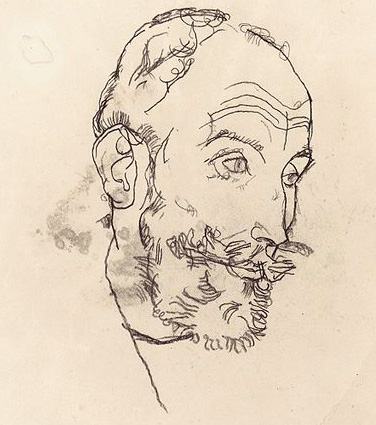
My second example is my favorite artist Egan Sheila. I stumbled on an exhibition in Rome years ago displaying only his sketches, and they had more of an impact on me than any other exhibition. Almost everything was in pencil and here again there was no place to hide, every line had to be perfect. The sketches showed more emotion and character than most paintings I know of.
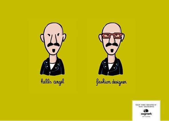
My final example is a piece of advertising that made me stop and look and if that’s not effective advertising I don’t know what is!

